
Consistent Colors in Digital Workflows: An Introduction to Color Management
Not all images are created equally! Instagram, Flickr, Facebook and LFI all provide ways to share your images online, so your images could be seen on various computer displays, phones and tablets – all containing different types of screens. Blurb and Artifact Uprising are two on-line self-publishing book companies where you can have your images bound in print with different paper types. You can order prints on many more paper types, metals and under acrylic or even print them yourself on inkjet printing systems. Did you know that using the same image with no adjustments for all of these would not produce images that looked the same? If you are not sure what sRGB, Adobe RGB and ProPhoto RGB are, this article is for you!
Before digital photography became mainstream and film was the media for making images, the photographer was also a physicist and chemist. The camera exposed film and the photographer developed it. The chemistry was the black box that converted the exposure to a permanent image. While a negative could be manipulated somewhat when printing, the choices were made much earlier in the process. Today, in the digital world, the photographer no longer needs a chemistry background because the black box is now the computer chip inside the camera developing each pixel on the sensor to create a digital negative file (DNG or RAW). However, a digital file allows for almost infinite manipulation. Each pixel can be adjusted – for color and brightness – without impacting the pixel beside it. Computer noise can be added or subtracted and the resulting image can be made bigger by adding pixels or smaller by removing them.
One item remains the same. Photography is meant for viewing, for sharing and for preserving an image. The most complex step for processing a digital image after exposure is color. Even the LCD screen on the back of a camera presents colors differently than a computer screen, an internet browser, a print or a book. Because none of these ways we view an image shows colors the same way, you need to understand color spaces and how to use them in your workflow.
While I normally write about a location, lens and camera, this topic is certainly more technical. Here we explore reproducing your images, consistently, the way you see them in your mind and on your computer screen. There are some great resources if you want to learn more, and I will point you to those at the end. If you wish to master photography, today you must also master color. Even though black and white images contain only whites, grays and blacks, to avoid disappointment, you must understand color.
First, a few terms and concepts. When I talk about ‘displaying an image,’ I am referring to posting on the internet, printing in books, on paper and other media for hanging. Choosing a color space for displaying your RAW images has different implications based on your intended use of the image and your other equipment. Understand that a RAW file does not have a color space. A RAW file just records the amount of light hitting each pixel at exposure. Instead, our software chooses a color space to show on the screen, on the internet or on a printer. Leica chose to use a DNG file, which is a universal RAW file.
When exporting image files, like JPEGs, we must assign a color space so the computer, iPad or iPhone screen can determine how to display the colors. Paper is similar. If we send an exported file to a book printer, like Blurb, we must choose a color space so Blurb can print the image accurately on their paper with their printer in a book. If we pick a color space that Blurb does not use, we can lose control of how the image will look and it may or may not print well (I have made that mistake in my early books and they came out very dark and unusable).
To understand color management, we first remind ourselves what light capture is for a digital image. Then we talk about color spaces and finally how to manage the colors for various outputs. I will share some of the equipment I use, how I use it, and show examples of the impact color management has on some images.
Note that color management for video files is different than for digital image files, and while the concept is similar, video color management is not discussed here. If this seems too technical, you can skip to the bottom of this article and see how I manage my workflow.
LIGHT CAPTURE
In the beginning there was light, and then the shutter opened to capture an image. Light is the key to photography and color management is about displaying that light.
Light has an intensity – it is either bright, dim or somewhere in between. Our eyes see with light and we decide to take a photograph. We set our exposure based on the measured amount of light and something will record the light – either film or a digital sensor. For digital photography, we need to understand how the sensor reacts.
light capture key concept: Sensors record colors based the amount of red, green and blue light at any given point.
Light, on a camera sensor, measures the color based on the Bayer filter which uses a mathematical formula to convert light to color (for those that care, it was developed by Bruce Bayer of Eastman Kodak in 1976 where twice as many green points were used with red and blue points – thus over four pixels on a sensor, 50% or 2 are green and 25% or 1 are each blue and red). Leica uses the Maestro chip to convert the color-filtered-light and produce a DNG file containing a color value for each pixel. It takes four pixels to calculate a color value. Manipulating color with editing software does not affect the data in a DNG file, but it does affect how our com- puter monitor shows us that image. Color choices also impact how the LCD on our camera shows us the image and any resulting JPEG created by the camera and recorded on the SD Card – even when the choices are made by the camera.
WHAT IS A COLOR SPACE?
Color space is effectively a group of specific color values that is less than the total color space of all colors our eyes can see. There are different ways of showing color spaces, or gamuts. My favorite is called the ‘horseshoe’ graph. Everything inside the horseshoe shape is effectively a color we can see.
Figure 1 shows a colored shape inside a ‘horsehoe’ that does not touch the edges. This shape represents sRGB and it is the smallest color space of the three. Figure 2 shows sRGB inside the largest color space, ProPhoto RGB. You can see how much more color ProPhoto RGB can display. Figure 3 shows Adobe 1998 RGB inside ProPhoto RGB. So you see that some color spaces can show more colors than others. Why not just use the largest one and move on? Answer: It depends on your use.


Colorspaces are either independent or dependent. Independent colorspaces are determined by calculations and independent of the measurement of something. The representation of sRGB, Adobe RGB and ProPhoto colorspaces is based on a mathematical calculation. That is to say, the triangle would never change or move around, each of these three color spaces is fixed no matter what.
A device that measures light input or produces output based on measurements uses a dependent color space. Devices are all made differently – different camera sensors, different monitor screens and different printer inks and papers all have different characteristics. For any black and white film buffs, this is similar to different characteristic curves of film which produce different representations of blacks, greys and whites from the same exposure. So, anything we use to display an image uses its own special color space, specific to that device.
key concept number two: All devices do not show the same color in the same way, so an ICC profile is created to try and produce colors correctly, within the limits of the device.
Each device measures color and then does its best to repro- duce that color. The problem is that none are perfect and none produce all colors. So, an ICC profile is created for each device. Printers have an ICC profile for each ink set and each paper used with the ink set. Monitors and displays are only capable of showing a certain amount of colors using their ICC profile. Each ICC profile contains two items: (1) the list of all colors that can be reproduced, displayed or acquired by the device and (2) the error correction needed from an input color to output it properly. ICC stands for International Color Consortium and they are the standard in color.
The ICC profile produces two main results to help us get the colors we expect from our workflow. First, if the device is given a color on the list it can reproduce, it corrects that col- or and produces it – in the closest manner it can based on its limitations. Second, if the device is given a color not on its list of capable colors, it first has to convert that color to one that it can reproduce, and then it corrects that color and reproduces it. Using these ICC profiles is what color work- flow is all about and this concept of color conversion becomes important when we choose a color space to use with our Leica.
Whew! Think of the ICC Profile as the magic that makes our images look the same, no matter how we want to show them, provided we know how to manipulate our image inside them. Nothing is more frustrating than looking at your prize- winning photograph on the computer screen and then looking at a print on paper or in a book that is dark, dull or lifeless. Let’s recap.
color space key concepts
There is only one independent color space for each type: sRGB, Adobe RGB and ProPhoto. It is a formula and shows exactly the same way on a color graph every time because no correction needs to be made to the formula. Indepen- dent color spaces are effectively the baseline all other dependent color spaces are trying to achieve.
On the other hand, there are dependent color spaces for each device created and they are all different because each device can reproduce a different number and type of colors and requires different error correction before outputting the colors.
Color workflow is about choosing a color space to work in and then using the proper ICC profile for your display, and manipulating your image to reproduce the image with the colors you expect to see.
COLOR SPACE SATURATION
Remember that our fixed color space choices are sRBG, Adobe RGB, and ProPhoto. Remember also that each larger colorspace contains all the colors of the spaces below plus some additional, more saturated colors.
color saturation key concept: The sRGB colorspace contains the least amountof highly saturated colors and the ProPhoto space the most saturated colors. The Adobe RGB color space, being in the middle, includes more saturated greens and slightly more saturatedbluesthansRGB.But,while ProPhoto RGB includes more satu- rated greens, it includes much more saturatedbluesandredsthansRGBand Adobe RGB.
Unfortunately, many devices still only reproduce sRGB. Even expensive monitors may only reproduce 98% of Adobe RGB. However, our camera sensor may be capable of capturing colors well outside that range, even if we cannot see it!
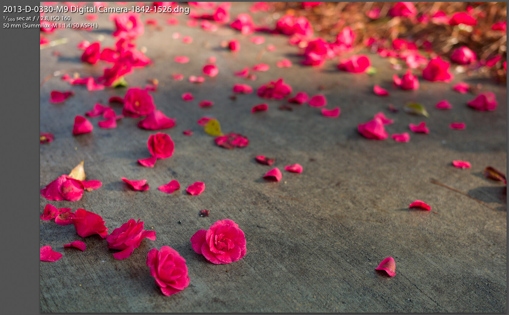
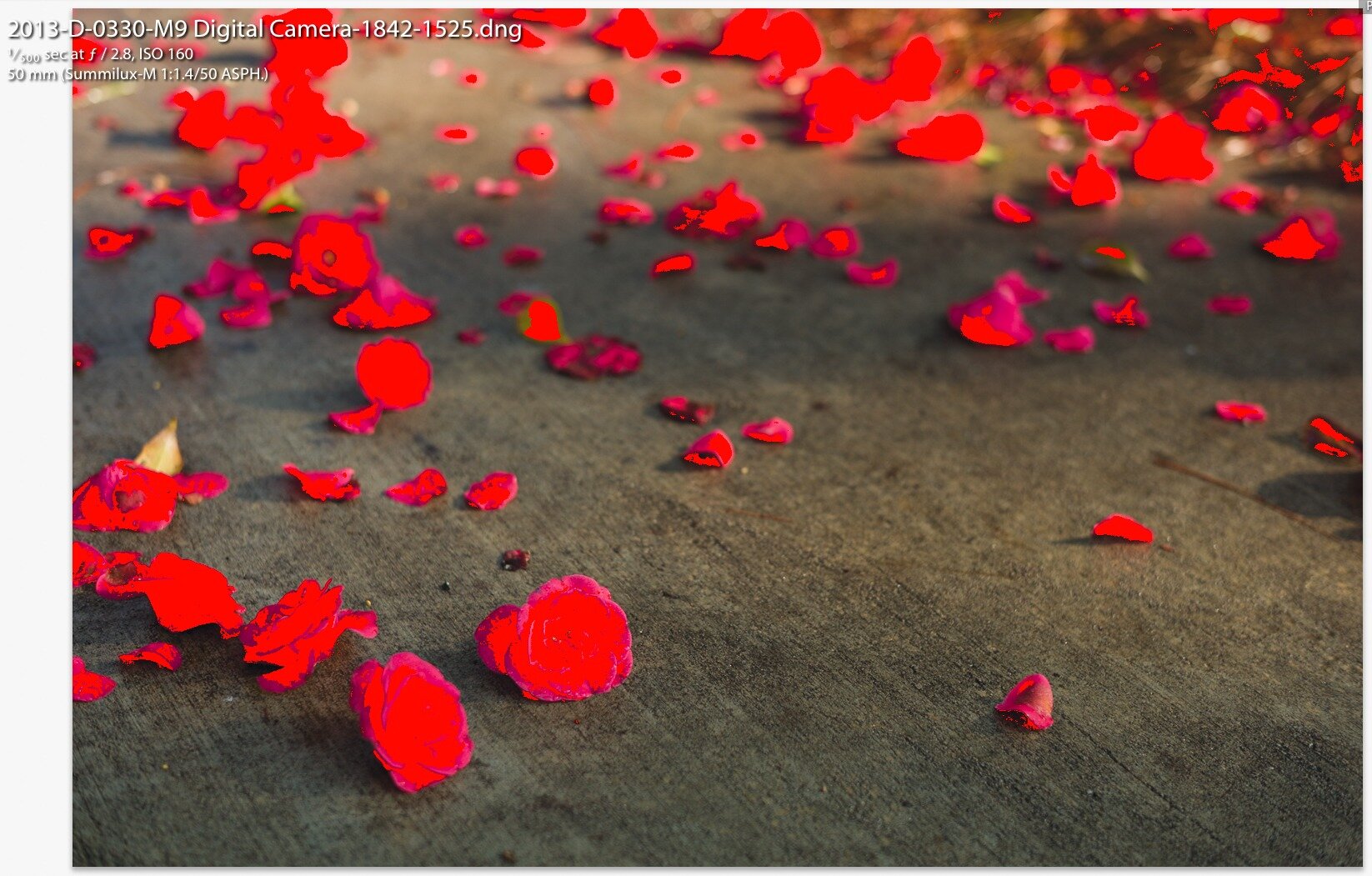
So, if our image does not contain a lot of saturated colors, it may look exactly the same in all three color spaces! But, if we have a landscape photo- graph full of greens, it may only look the same in Adobe RGB and ProPhoto RGB. Sunsets, on the other hand, may look different in all three color spaces because of the saturated reds! If we use a color space that is too small for the colors in our RAW file, then they all blend together in one big blob. See Figure 4a with a some red flowers. Figure 4b shows all the reds that will not print properly. If this image were printed as is, it might look like a red blob – not what we want!
Black and white film photographers have long had this same problem. Taking a photograph on different films shows different contrasts. Color filters produce different contrasts through the light entering the lens. Different development times produce different negative densities, and to top it off, photographic papers show far less tones than the nega- tive! In reality, digital photography has less moving parts than film and much can be handled by the computer. In fact, I perform all my photographic color management in Adobe Lightroom.
MY COLOR MANAGEMENT WORKFLOW
If you skipped everything in the middle of this article, you can now see what process I go through, but I encourage you to find some time to read the entire article and see how it might help you get images to show the way you want them to be seen.
my equipment: I frequently shoot images of sunrise and sunset at the beach, which consists of a considerable amount of saturated reds, yellows and oranges. I also take images of lush green landscapes with blue skies. I hope that printing inks and papers will eventually catch up to the camera sensors, but even today printing is much easier than a decade ago. The Leica S007 provides a 15-stop dynamic range and excellent color capture for most of my landscapes. The Leica SL and M10 both have strong color capture routines as well but slightly less dynamic range and I use them when traveling or walking around. But, I have hanging prints from images taken with an M8 and a Dlux 3 – and they use the full range of color on the paper and most people cannot tell the difference in camera used.
I have used EPSON printers exclusively because I prefer the EPSON results from their ICC profiles on various papers. I used an EPSON R2400 for many years and got fantastic 13×19 black and white and color prints using EPSON papers. I retired that printer for an Epson Sure Color 800 last year which has newer inks and prints to 17×22. Whatever printer you use, download the ICC profiles for that printer from the manufacturer’s website. While you can print directly from Lightroom, I use a product called ImagePrint Black because it provides great output on paper. This product is expensive and you do not need it, but it makes great prints to frame in color or black and white.
I also print Blurb books and so they use a printer and paper different from mine. Luckily, you can download an ICC profile to proof your work on your monitor before sending it to blurb. I do exactly that.
I process my images in Adobe Lightroom Classic on a 2011 iMac with a 27” display. This is an old computer, but I calibrate the monitor regularly with an X-rite i1Display Pro and rarely have trouble with some very saturated colors. My point in sharing this is that you do not need to most current equipment to get great images from your Leica camera. I use the factory ICC profiles on both my Leica cameras and the EPSON printers. But, I can see what I will get before I print – consistently. Today, most monitors have wide color spaces. If you print a lot, you may want to invest in a specialized monitor that covers 99% of the Adobe RGB space, but be prepared to shell out several thousand US dollars. The key is to calibrate your monitor to ensure colors are accurately represented. The X-rite i1Display Pro is about USD $250 and saves me more than that in ink, paper and Advil (for headaches!).
how I use color spaces So, when do you have to pick a color space? Answer: every time you export an image in Lightroom (or other software) or every time you print an image.
For printing my first choice is ProPhoto RGB as a color space, and that is what my default is set to in Lightroom Classic. To be fair, Adobe says that in all parts of the Lightroom Classic program, images are shown using Adobe RGB, except in the Develop module. In the Develop module, Adobe says that ProPhoto RGB color space is used. I use Adobe RGB when exporting to Blurb and sRGB when exporting to the internet. My printer is somewhere in-between all of these color spaces, so I proof and adjust my image as I show you below.
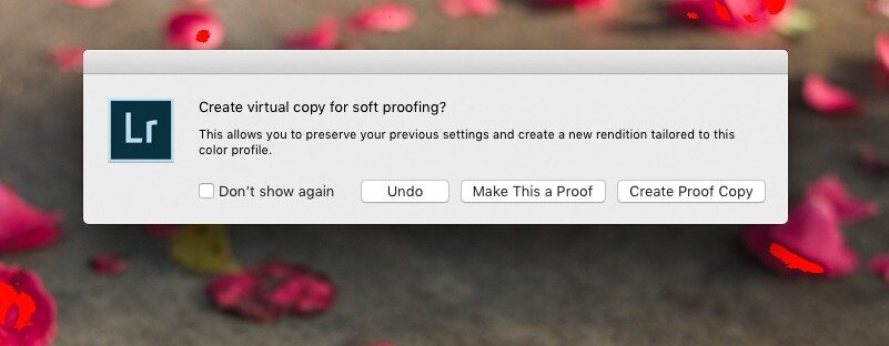
figure 5
my complete workflow
I calibrate my monitor using an X-Rite i1Display about once per month, although many professionals recalibrate after 200 hours of use. If I cannot get a print to work, I stop and recalibrate the monitor and then keep going. That fixes most problems. Also, I turn on my monitor about 30 minutes before I use it. This gives it time to warm up. Cold monitors show colors differently, so I use that time for emails, software updates and anything else but proofing colors.
I also have all the Epson SC 800 printer ICC profiles from Epson installed on my computer, including the Epson inkjet papers. I also installed the Canson Infinity ICC profiles for papers I use and the Blurb ICC profile from their website (see below for links). Most of my prints are 13×19 and 17×22 (inches), so getting the colors to separate the way I want them is important.
In Lightroom Classic, I select my image. Then I open the image in the Develop module and take a snapshot of the image, labeling it something like “Original Development and Cropping.” This is a fancy “undo” to go back to where I started.
At the bottom of the Develop module screen there is a checkbox that says “soft proofing.” By checking that box, the image displayed on the monitor looses contrast and color saturation and the background turns white. On the top right is a list of ICC profiles. I select the ICC profile for the Epson printer and paper for printing (a device dependent color profile). Alternatively, I select the Blurb profile or another paper profile, like Canson (all device dependent color profiles). Then, I modify the development of the image – contrast, highlights, shadows, etc. Immediately after making the first adjustment, Lightroom Classic asks about creating a virtual copy (see Figure 5). I select “create a proof copy” and a virtual copy is created with just these adjustments and the name of the image includes the ICC profile. This allows me to reprint or adjust the image and my master image is not modified. soft proofing key concept – If you choose the current image as the proof, you will have to jump back and forth between print proofing and screen proofing. Virtual copies take no space and allow you to edit one image for printing and keep one for viewing. To distinguish them, I use the purple color attribute for all my proof copies. Then, I can search my entire database, or just a collection and filter on the purple attribute to get all my ‘proofed’ images ready to print!
Then I crop the image for my use. If the image will be 17×22, I use a crop of 17.0 and 22.0. Since I print a lot and use very specific frames and mattes, I created a spreadsheet for the various openings so I know exactly what print size I want. Then the computer is not adjusting the image to shrink or enlarge it, but prints it exactly the size I want.
When ready, I export using one of three modes: (1) for internet images, the file, export menu, making sure to choose the sRGB color space, which is most compatible with everyone else’s devices, (2) for book publishing, like Blurb, export the image to a hard disk folder for that book, or (3) for printing the image I use the “Edit In External Editor” menu item, which I have preset to open Image- Print. I export the image using full resolution, a TIFF and the ProPhoto RGB color space. For printing, you can just as easily use the Lightroom Classic print module.
export in external editor key concept: Lightroom creates a TIFF file for external edits and leaves it in your catalog. This file takes up disk space and is not my original RAW file, so I delete it through Lightroom after I am done printing. The virtual proof copy and original remain untouched.
fixing oversaturated colors: Here is the key to getting good prints of saturated colors. In the proof view of Lightroom, you can select the paper icon on the right side of the color profiles. That will show you on your image any colors that are outside of the ICC profile you selected. This is the same as showing blown out highlights or shadows with no detail, but shows colors that will be blended together.

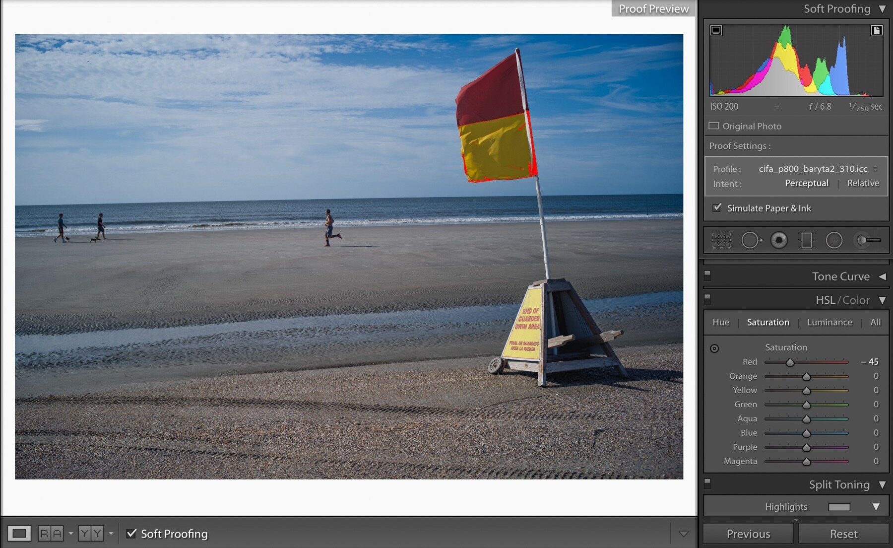
Figure 6a shows a beach flag proofing with a baryta paper. The red and yellow flag is too saturated. I used the HSL color sliders and lowered the red and yellow saturations until only a little was outside the print range. See Figure 6b for the resulting image which looked the same on paper. The key was reducing the saturation in order to print. I have found three ways to fix this problem.
1. First, I lower the white slider under the basic section. White makes everything brighter and saturates some of the colors. If this fixes the problem and I am ok with the rest of the image, I am done. If not, I raise the white slider until I am somewhere in the middle, leaving more saturation to fix.
2. After adjusting the white slider, I use the individual color sliders in the HSL development and reduce the saturation and change the luminance of the colors causing the problem. So, for my sunsets, it means reducing the red saturation and potentially reducing the luminance of the red. If it works overall, I am done. Sometimes the entire image starts looking too much like black and white. If so, I put the saturation back and move on to the last step.
3. The final adjustment is using the magic wan and painting an area surrounding the over-saturated colors that remain after the first two adjustments. Then, I play with the white slider and saturation sliders until I get what I want. Small adjustments are necessary here, or the image will look like it has an odd spot where the brush is.
This process I use for printing is exactly the same for exporting to the internet or exporting for a web site or even exporting to make a book. Create a proof copy, choose an ICC profile and then adjust the problem colors if any. You can find ICC profiles from the manufacturers of paper and printers. For the internet or my website, I use sRGB – the base standard that just about everything works with.
Figure 7a shows a flower image taken with the Dlux 3 directly in Lightroom. Figure 7b shows this image with proofing turned on for Canson Baryta paper. All the dark greens are too saturated to print on the paper. Figure 7c shows the final adjustments, boosting the hue of the green slightly (+13) and reducing the saturation of the green significantly (-49). Boosting the hue helped the image look less black and white after the desaturation. As an interesting comparison, Figure 7d shows the same original image, but with proofing for sRGB. Notice how even posting this image to Instagram with no modification might cause problems in the greens shadows!


CONCLUSION
There is so much more available on this topic by authors like Jeff Schewe who helped write Adobe Photoshop and Lightroom. Managing color is a lot like learning to use a flash – you have to practice to make it work. Most importantly, experiment and do not be afraid to choose different color spaces when you export or print your images – but proof it to see what it really looks like!
reading more For those that want to read more:
Amaud Frich has written an extensive work on color managagement (https://www.color-management-guide. com) and he refers to sRGB as the “lowest common denominator” of colorspaces. Frich is telling us that effectively all independent and dependent colorspaces contain or produce sRGB.’
The International Color Consortium talks about color management and profiles (http://www.color.org).
Cambridge in Color is a great photography resources and has a color management section (https://www.cambridge- incolour.com/tutorials/color-management1.htm).
Blurb Blog on color management for printing their books (https://www.blurb.com/blog/color-management-printing/) and download for ICC profile to use in Lightroom (https://www.blurb.com/downloads/Blurb_ICC_Profile.icc).
