
Avoiding Clipped Highlights and Shadows with Lightroom
One topic that must be understood by the successful photographer is how to avoid blown out highlights and featureless black shadows, often referred to as clipped tones. There are times when these are desirable in an image, such as a high key image or one with a dark silhouette. However, this article assumes you wish to have a full range of tones and no clipping.
Good tone control starts with a good exposure in your camera, which actually determines the mid-tones in your image. You should consider using the histogram function on your camera when you view the image you just took. Is it showing highlight or shadow clipping? Adjust your exposure accordingly and re-take the picture as needed. For M digital cameras, I can tell you from personal experience the M 240 is more tolerant of highlight clipping than the M Monochrom 246, which is very sensitive to highlight clipping. On the other hand, the M Monochrom 246 can handle underexposed shadows much better than the M 240.
Figure one below shows a range of tones from total black on the bridge structure to blown out areas in the upper part of the clouds, which amounts to significant clipping. Depending on display quality, this may not be obvious when viewed during image development in Lightroom. This image was taken using aperture priority auto exposure with an M 240, which for typical scenes, usually works fairly well. In this case, however, the brightest and darkest tones show little to no detail.
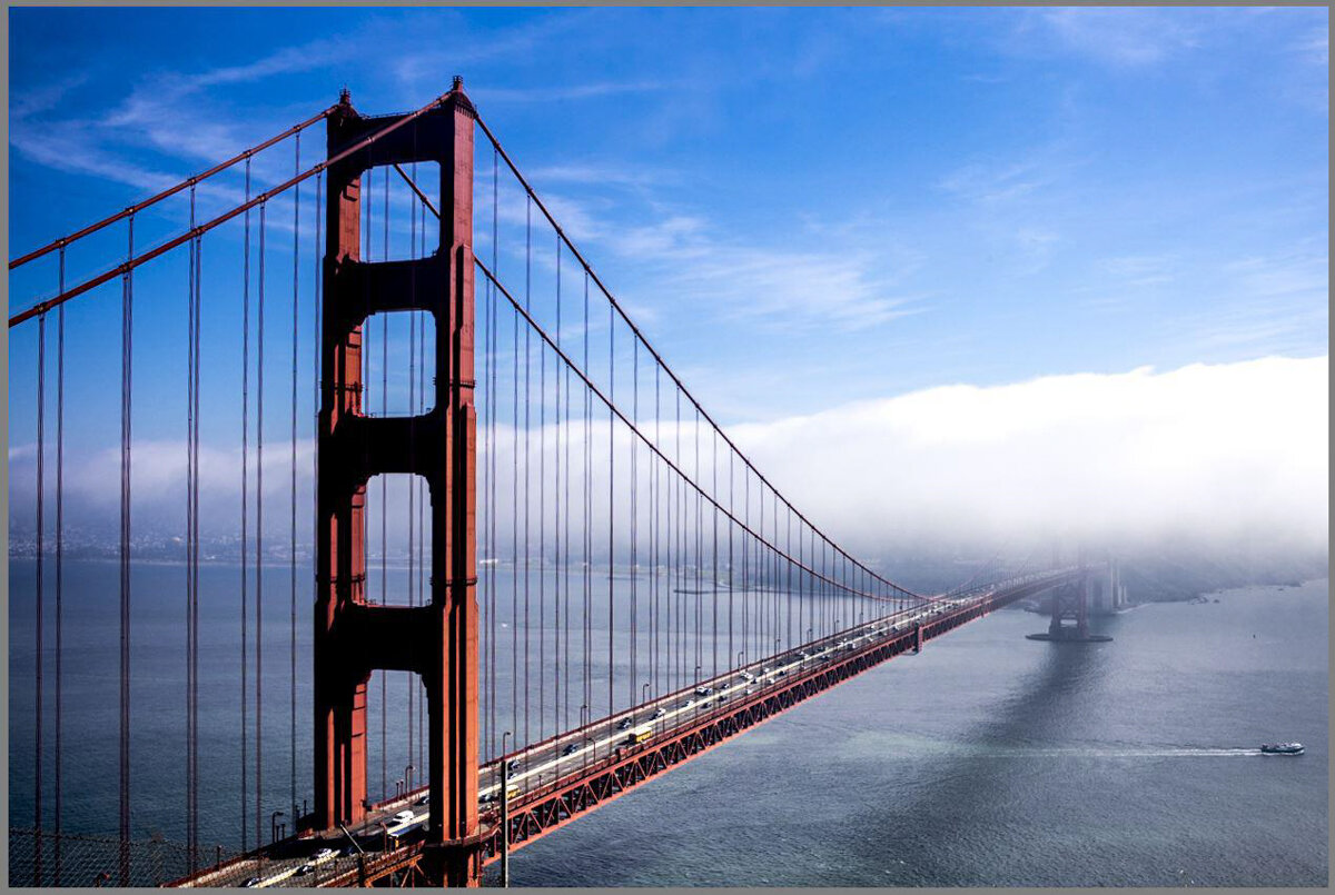
figure 1: Golden Gate Bridge image before clipping corrections applied.
To achieve a full range of tones, you first need to consider the histogram and what it means. Essentially, the histogram is a graphic representation of brightness of the pixels in the image. The height of the histogram curve represents the number of pixels (pixel count) of a particular brightness, and the shape and extent of the histogram determines the qualities of the image as presented on screen.
figure 2 shows the sections of the histogram that correspond to the Lightroom basic tone controls that are shown in figure 3. This means you can directly control the various tones shown by the histogram with the corresponding Lightroom control. When you adjust the Basic controls, you will see the pixels move according to the adjustments you make. Sliding the Whites control to the left, for example, causes the brightest pixels to darken and move away from the right edge of the histogram. For the typical image, let’s describe and illustrate the process for getting an acceptable range of tones.
figure 2: Histogram showing areas affected by Lightroom basic controls.
figure 3: Lightroom basic controls.

figure 4: Clipped highlights and shadows.
figure 4 below is a histogram that reflects the above image of the Golden Gate Bridge. Note that the triangles in both upper corners are illuminated and pixels are stacked up against both ends of the histogram. This means clipping is present in the image. The black pixels in the image are displayed on the extreme left of the histogram, and the white pixels are on the extreme right side. The two small squares in the upper corners of the histogram are shown in a bright outline, which means both highlight and shadow clipping will be shown on your display by red areas (clipped highlights) and blue areas (clipped shadows). To activate the clipping display in your image, type the letter “J” or click on each corner square.
figure 5 to the right shows both the clipped highlights (red areas in the clouds) and clipped shadows (blue areas on the bridge structure). This is only visible on screen with the clipping display selected.
Fortunately, this can be corrected fairly easily, assuming the image from the camera is not significantly clipped, which means the tones and detail are actually still present in the original image. figure 6 shows the basic panel controls which result in the clipped areas in figure 5. figure 7 shows the corrections that are made to correct the clipping issues completely.

figure 5: Shadow and highlight clipping display.
When comparing the two basic panel controls shown in figures 6 and 7, note the exposure was increased slightly, the highlights were reduced, shadows were increased, whites were reduced and blacks increased. The best technique is to slowly adjust the Shadows control until the shadow tones are acceptable, then increase the Blacks control just enough to eliminate the clipped (blue) areas on screen. Similarly, adjust the Highlights control until the highlight areas are acceptable, then adjust the Whites control only enough to eliminate the clipped (red areas) on screen. The final version (figure 8, cover page) after correction of the clipping, shows a pleasing range of tones from very dark (the bridge structure) to almost pure white (the clouds). It is important to note that the brightest and darkest tones still show some detail.
The corresponding histogram (figure 9, below left) no longer shows clipping alerts (triangles) and the pixels are well within the normal brightness range at both ends.
figure 6: Basic controls causing clipping.
figure 7: Basic controls figure
figure 9: Histogram of corrected image.

figure 8: Golden Gate Bridge. Final lightroom version with clipping corrected.